
Color Died in Corporate Business and Beyond
Has anyone noticed the blaring lack of color in the consumer world? We barely see any color in buildings, cars, clothes, or even nursery decor. The nursery decor was what really got me a couple of years ago when I had my son. I noticed an alarming increase in gray color schemes for nurseries. Gray seems to be everybody’s favourite color of the decade. And it isn’t that I completely hate gray. I think it’s quite pleasant in some applications, to an extent. But when all around us we see so few rich, vibrant colors and instead see almost exclusively neutral palates, I quickly tire of ‘barf beige’, ‘gloomy gray’ and ‘boring black’. I wouldn’t call many workplaces’ interpretation of color very inspiring, either. When you’re instead surrounded by beautiful, bright hues that foster a jolt of happiness, you realize how therapeutic it is to use color in your environment.
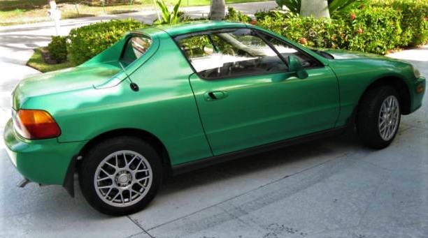
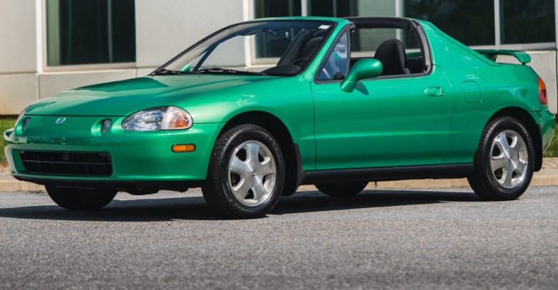
The Most Obvious Example of Society’s Lack of Color: Automobiles
The most classic example of society’s decreasing color is automobiles. Most cars in the USA are utterly boring. Apparently the rest of the world’s cars aren’t much more colorful, either. While recently visiting the zoo, I noticed that my own tame-red sedan was the only ‘colorful’ vehicle in our row of the parking lot. All of the other vehicles were black, gray, and similar shades.
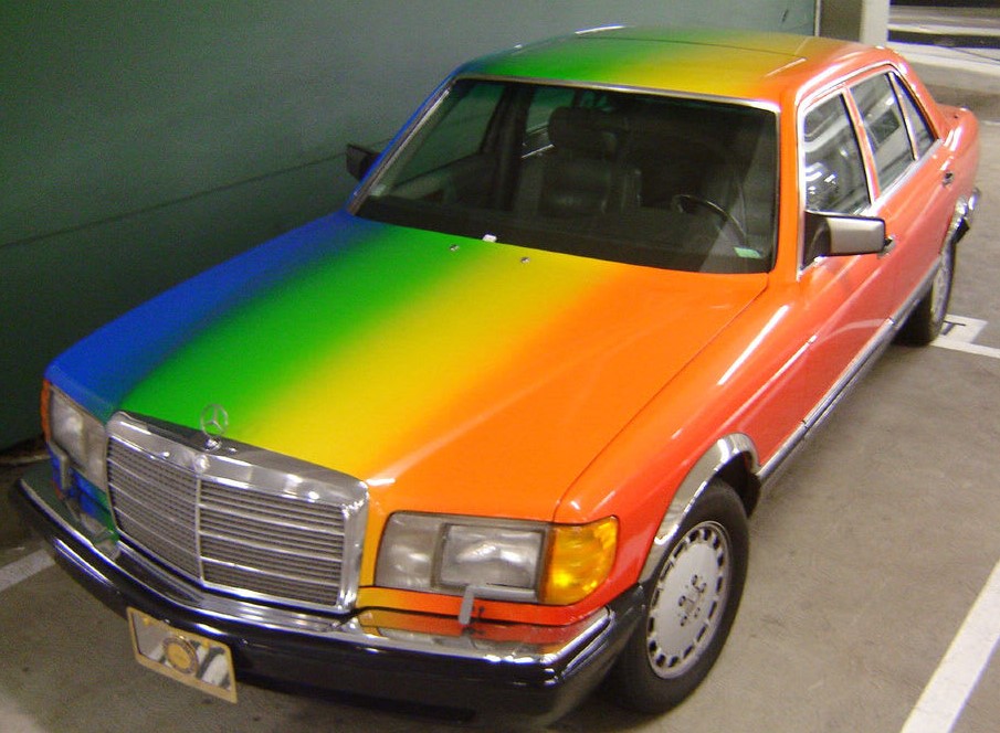
I notice a monotony of grayscale vehicles almost anywhere I drive, now. And while I am not the only one asking why, why today’s cars are so boring compared to the mid-century gems, the past two decades’ decline in color is not necessarily going to change any time soon. People choose boring, ‘safe’ colored cars that match today’s sleek and modern technology. Only a minority opt for brighter, bolder colors and the industry restricts those factory options.

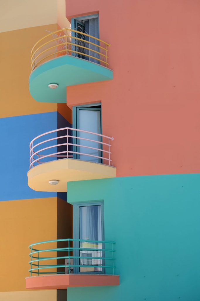
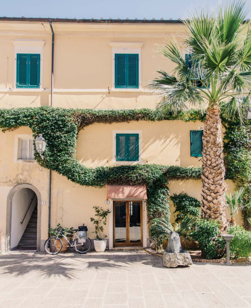
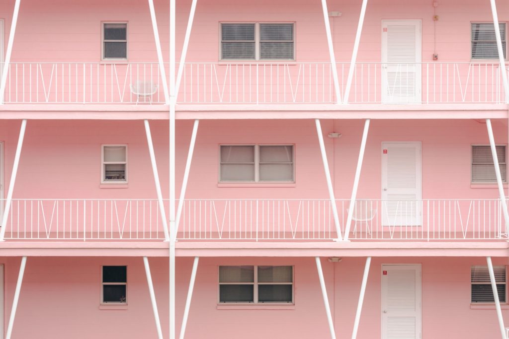
The automotive industry and its interpretation of consumer demand isn’t the only culprit. Color is also missing from the interior and exterior walls of most homes. Walls are usually painted gloomy gray, boring beige, or weak white. On one hand, this makes more sense because people then have more liberty to use furniture for pops of color. Neutral walls open up more color possibilities for furniture, linens and fixtures. However, I can’t say I’ve seen a whole lot of colorful interior design, either. It isn’t just wall colors – most homes as a whole are a very tame, uninspiring neutral palate. Of course this doesn’t always look bad, but neither is it in any way interesting or inspiring. It is flat out boring.
Western Adults Shy Away from Bright Colors
Why is color so subdued in our culture? What are we afraid of? If dull grays, blacks, tans and navies dominate the corporate wardrobe, why must they also seep into everyday fashion? Athletic wear seems to be the only primary fashion sector that employs bright, popping colors. I do appreciate plenty of nice neutral color schemes for apparel, but I also adore bold color. We as a society seem to have shifted almost entirely to the neutral side. We need much more color therapy in the balance.
The Unspoken CPF: Color Police Force
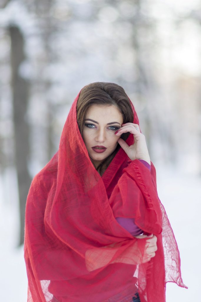
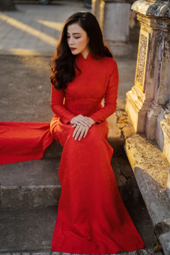
People associate bright, happy colors with childhood and therefore shy away from them for fear of looking ‘childish’. Think about it. How often do you see a grown man walking down the street wearing normal street clothes (not athletic wear) in bright green and yellow? Bright orange? Purple? Now, how often do you see men wearing black? Brown? Navy blue? Muted red? Burnt orange? Khaki? It’s as if people are afraid of loud colors. People want to fit in, to not ‘rock the boat’. But what if someone genuinely likes bold colors? Unless they are truly self-confident and don’t have another agenda (such as a job interview), they will not wear their favourite colors out of fear of looking strange. And while men do sometimes wear pastels such as pink or perhaps even lavender, that style is generally reserved for the golf course or college fraternity garb.
What happened between childhood and adulthood that made us turn off colors? Why do we walk into any daycare, school, children’s museum or event center, or park and see a fantastic display of color, but we see serious neutral colors in almost any ‘grownup’ space? Why can’t adults have their color therapy, too?
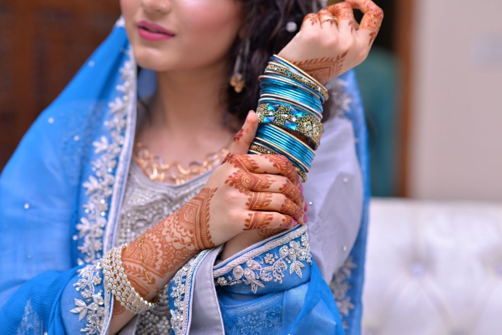
This is primarily a Western phenomenon. In other countries such as India and parts of Central Asia, men and women wear plenty of color and architecture – both interior and exterior – is adorned in it. Is it an over-focus on efficiency? A subtle demand for seriousness, business at the cost of beauty, art and whimsy? Why is color in the adult world reserved only for the artistic spaces? Why not everywhere?
A Campaign to Bring More Color Into Human Life
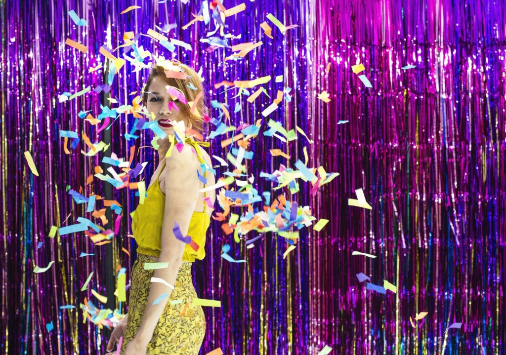
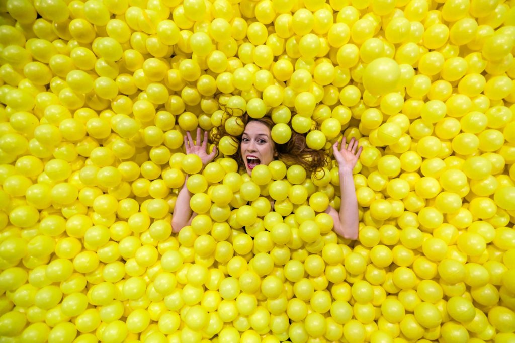
If color therapy truly brings happiness, why not incorporate it into more built environments? Why not enrich our environment, in the same way that we enrich animals’ environments at the zoo in order to give them a more fulfilling life? Thankfully, some of the more cutting-edge organizations are now incorporating more color into their workplace designs. Companies have come to understand that using color appropriately in the workplace improves morale and productivity. Research shows that different colors (and their varying hues and shades) affect people in different ways. These nuances are useful when using color for specific purposes such as to improve concentration. While a formulaic use of color therapy is appropriate for a workplace, I believe it is best to go by your own rules when you use color in your environment at home.
It is helpful to know that warm colors can be stimulating and cool colors can be relaxing (and there are many more nuances than that generality). Everybody hears about people painting the walls of dining areas red and bedrooms blue. But I wouldn’t shy away from any color for fear of being over-or-under stimulated in any given space. The room’s layout, the color’s shade, the effect of light, and other fixtures and furniture also impact the overall effect.
Color Choices are Personal and Different for Each Individual
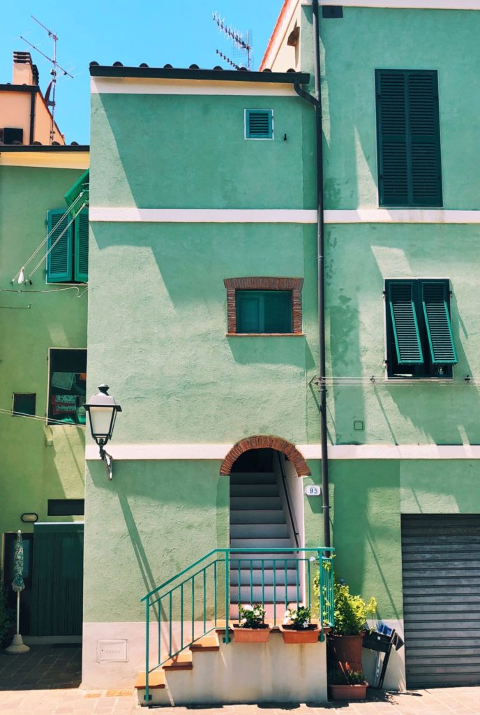
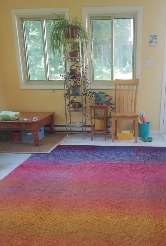
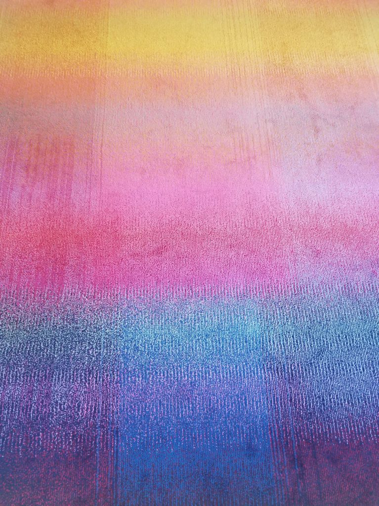
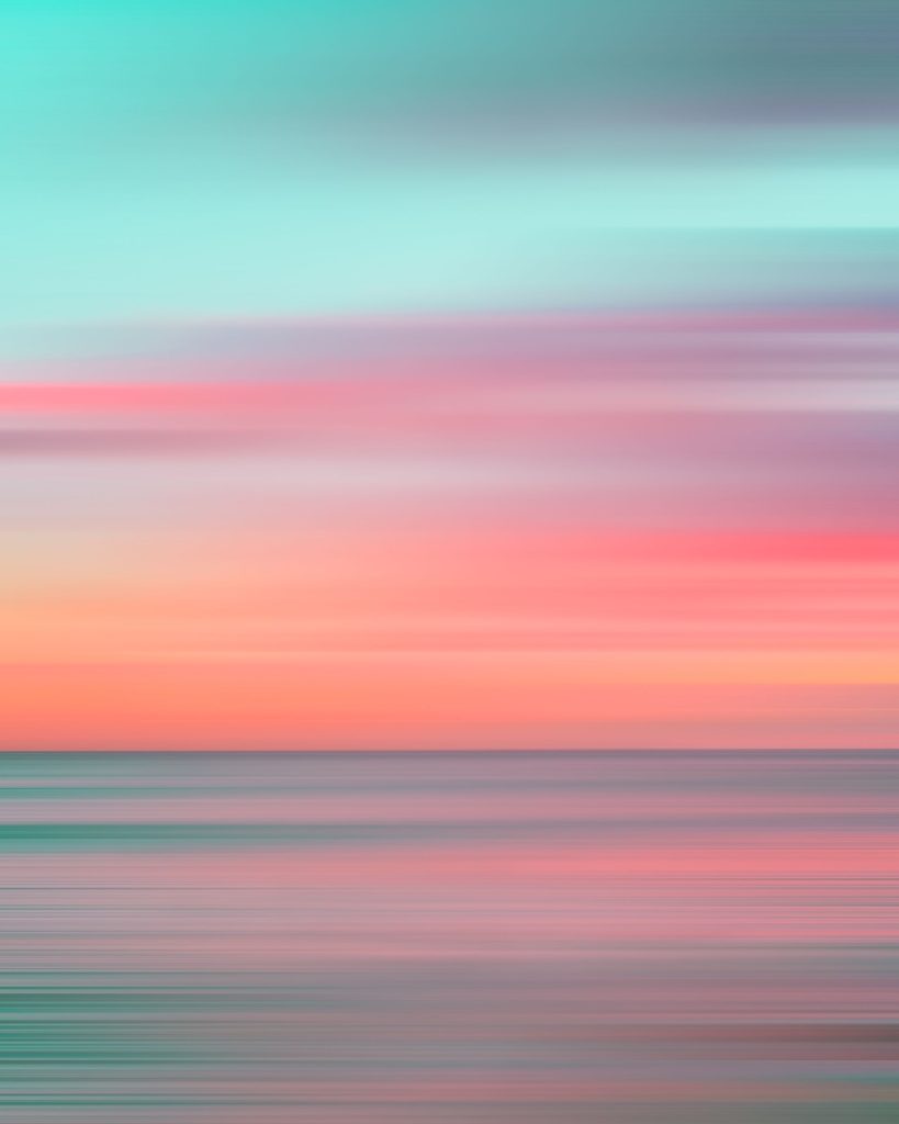
The most important thing is to go with colors you love. The affection you have (or don’t have) for any particular color holds a deeper stake in your psyche than the common psychological associations with colors in general. Seeing colors you love, or in color combinations you love, can bring a deep and spontaneous joy. And we often subscribe to a particular color palate, with a specific saturation and shade. The walls in my house, for instance, are painted in pastel colors such as sea green and light blue. Other people love bright, Caribbean-inspired colors like bright sky blue and coral. Some love rustic Southwestern-inspired colors like burnt orange, cactus green and mustard yellow. Others go for bold primary colors.
Colors of similar saturation and shade complement each other better than combining a bright lime green with army green, for instance. They are two different greens entirely. You’ll better appreciate lime green next to purple. This is why I do not tell people that my favourite color is green. While there are some gorgeous shades of green that I love, such as jungle green, there are many that I dislike, such as pea green or forest green. So if anyone asks specifically, I tell them my favourite color is sea green. When you choose colors for your home – whether for walls, furniture, linens or other accessories, know exactly which colors you do and do not want to see. Start there, and then perhaps consider the weight of any psychological impact (i.e. red in the bedroom, etc.). When you use color in your environment, only opt for what you truly love.
Wardrobe Department
For clothing, you have much more flexibility since you can change your clothes any time you want! Re-painting your walls is a little more involved. While we are generally restricted in clothing options for our jobs (unless you work for yourself), you can find ways to incorporate colors you love in your street clothes. And while there is plenty of fashion psychology exploring the use of colors in apparel and what they covertly communicate, we have our own preferences and ought to simply wear what we like. If it makes you happy, wear it! Sure, some people may feel threatened or intimidated if you wear black or red, or bored if you wear white, but who cares if you look and feel fabulous?
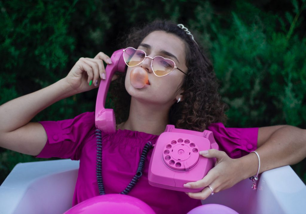
Even Cosmo’s aware of the powerful benefits of incorporating color into our wardrobes. Their July/August 2021 print issue featured an article on color therapy and the impact that colors can have on our emotional state. Wearing green, for instance, can help rejuvenate our mind. Yellow is an especially happy color. Pink can foster feelings of self-love. Bright shades boost our mood. And living with a two+ year pandemic requires as much mood-boosting as we can muster.
The Takeaway: Surround Yourself with Your Favourite Colors
If you love seeing all colors together as a rainbow starburst, buy or create rainbow things in your home. If you adore shimmery metallic hues, outfit your space accordingly. Seeing and being surrounded by colors that make you happy is an important and powerful way to subtly improve your mood and motivation. Use color in your environment to foster optimism and inspiration!